Logo
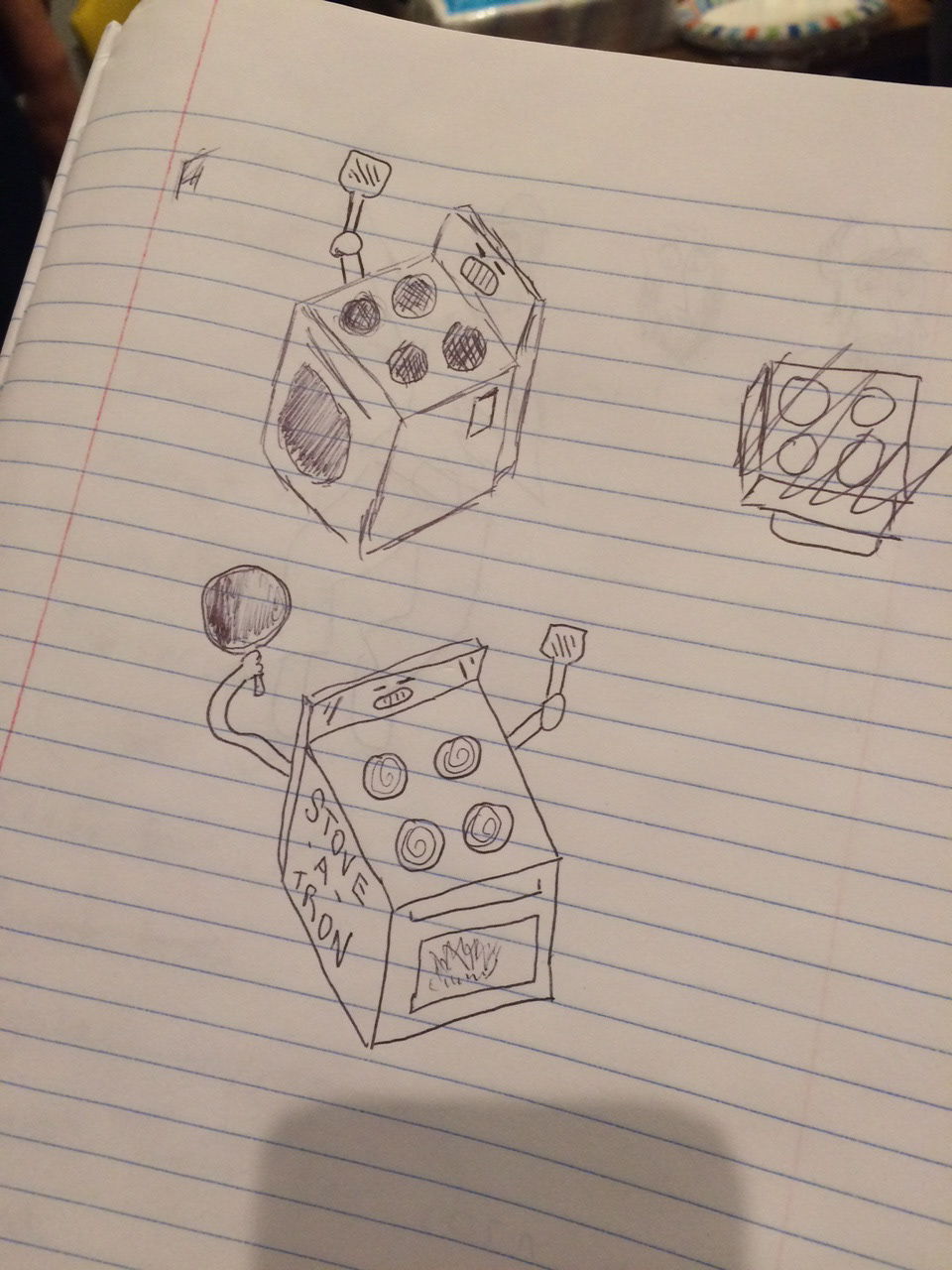
The original logo mark was sketched out by Michael Alvino.
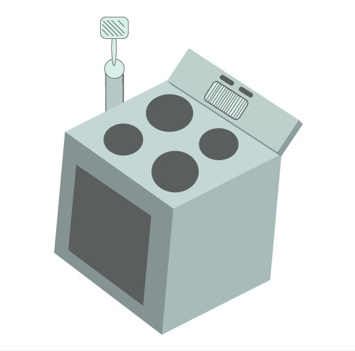
And I adapted it in Illustrator.
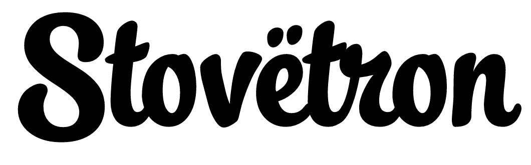
The typeface is a variation of a web font called Lobster. We wanted a street script type of font and found that Lobster incorporated the umlaut the best. The spelling was defined early on. The pronunciation is like Stove-uh-tron, and the umlaut may or may not suggest this sound, but we thought it looked dope, so we stuck with it. With the amount of times I've googled: e with an umlaut just to make a promotional flyer; we could have come up with a better spelling. This logotype is our mainstay, but we adapt it to whatever medium we are working in.
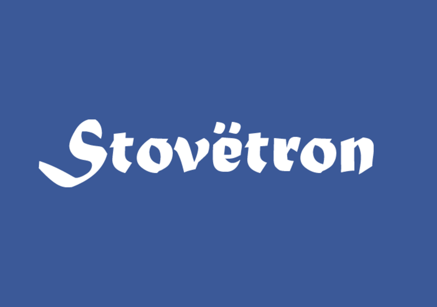
A Facebook option.

Our Soundcloud type.
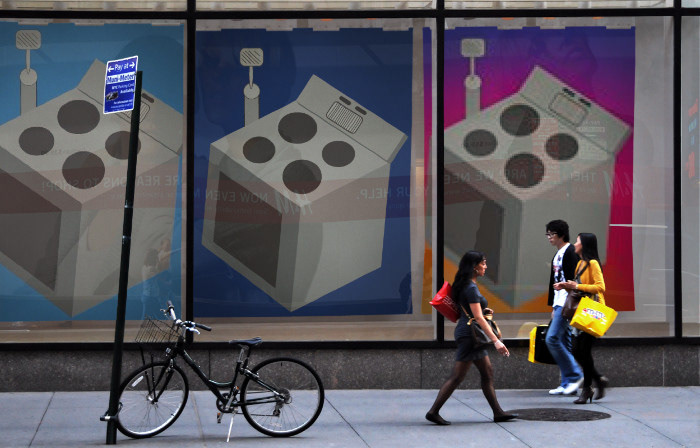
Our logo mark background also changed based on the social medium (Twitter, Facebook, Instagram).
Social Media
The main mediums we are represented in are Facebook, Twitter, and Instagram (with our strongest presence in Instagram).
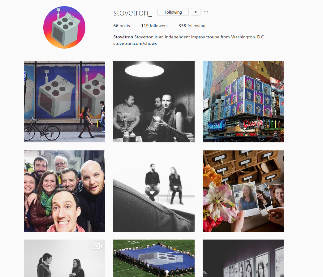
We don't necessarily have a lot of followers, but we do get a lot of traffic on our photos, and get a lot of compliments from them. Our voice is often the line between humor and heart.
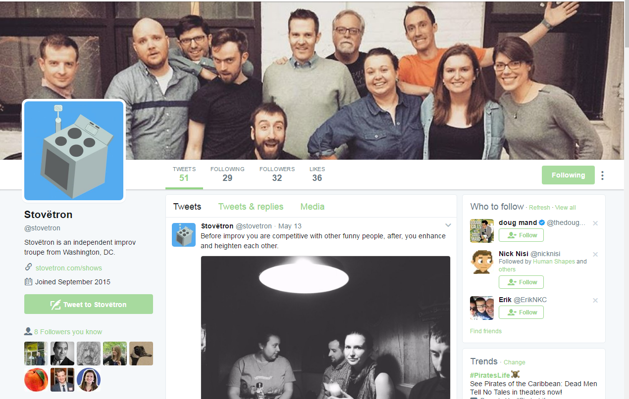
Our Twitter presence could be better, but the time it takes to think of good creative content and the people we'd reach isn't worth it.
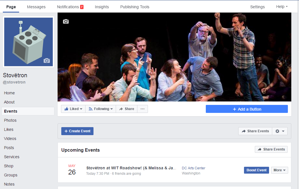
Our Facebook is often where we get our most interaction from our shows, because people can post on our walls, and we can promote our shows here as well.
Promotion
We are often complimented on how well we promote our shows and our brand; and it certainly helps our street cred when there's a good brand to go with it.
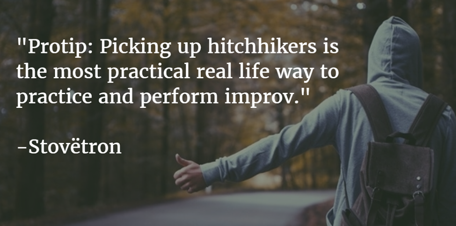
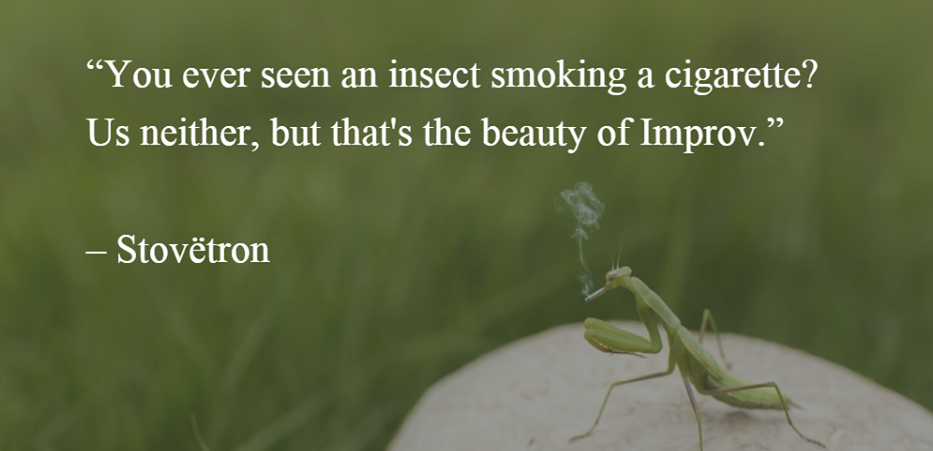
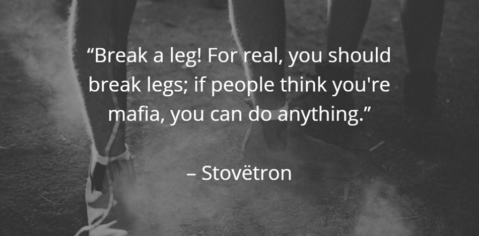
As a way develop brand awareness, we began creating quotes (said by Stovëtron) with the hopes that they would be shared by other improvisers in our community, thus establishing our voice (although witty) as thought leaders.
We are often trying to find new mediums to experiment in, like this one.
To be continued...